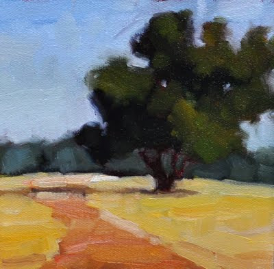
Field Guide, 6 x 6
This was another value planes study I did early this morning--again taking it slowly as an exercise in making accurate value decisions. It's funny, though, because I was using yesterday's paint (which I'd moved around on my palette), and was so tired I wound up using pthalo blue instead of french ultramarine to mix my greens. Not an "accurate decision," but I decided to stick with it, as it was just a study and the colors didn't matter as much as getting the values right. It put a twist on things, but I kind of like the resulting color combinations.
-julie davis

3 comments:
I agree with you that greens are so problematic, the right green in a tube must still be invented. I sometimes use bits of colour on the palette, which is known as guilt colours, you use them because you feel guilty to scrape them off. I love this plain composition!
Hi Julie,
I love how it worked out. I've just started using more pthalo blue myself. Not in a green mix. It does interesting things. Another super landscape with a nice abstract quality.
xoxoxoxoxBarbara
Thank you, Barbara. Pthalo can be a dangerous color-it can do wonderful things, but it can permeate everything easily-I really use it sparingly, and was so tired I didn't notice I'd put my "yesterday's paint" blue in the ultramarine spot on my palette. Normally, I'd have wiped down, but I forged ahead....
Post a Comment